Monthly Archives: July 2017

Part 5 – Videos and photographs of my sampling and final maquette

13 July 2017


Part 5 – Videos and photographs

The purpose of this post is to present additional photographs and videos of the sampling leading up to my final prototype/maquette. They have specifically been produced to aid my tutor’s understanding of the work, which is too large and delicate to send by post.


Videos

The video form a series which chronicle the development of samples to the final prototype/maquette.

The first video in the series talks a little about the lead up to the work then discusses sample 9:

The second video discusses sample 10:

Video 3 deals with sample 11:

Next, video 4 presents an investigation into different materials (sample 12):

The final video presents the final prototype/maquette:

Photos

All the photos are additional to those contained in the main blog and are included to show the sample in different ambient lighting conditions and orientations.

Sample 9:

The two photos below were taken on 11 July at 19:30hrs in the garden, when the sun was low in the sky. The sample is West-facing.

Photo 1: Sample placed vertically


Photo 2: Sample placed horizontally

The photo below was also taken on 11 July at 19:30hrs in the garden. The sample is South-West-facing.

Photo 4: Sample placed vertically

The next photos was taken on 11 July at 19:30hrs in the garden, but in a shaded area (nonetheless some shadow is still visible).

Photo 5: Sample placed vertically.

Sample 10:

The photos below were taken on 11 July at 19:30hrs in the garden, when the sun was low in the sky. The sample is West-facing.

Photo 1: Sample placed horizontally.

Photo 2: Sample place horizontally (detail)
 
Photo 3: Sample place horizontally (detail)
 
Photo 4: Sample place horizontally, viewed from above.
 

Sample 11:

The two photos were taken in July at midday in the garden, with two different foliage backdrops:

Sample 12:

The photos below were taken on 11 July at 19:30hrs in the garden, when the sun was low in the sky. The sample is West-facing.

Photo 1: Sample viewed obliquely at eye level.

Photo 2: Sample viewed obliquely from above. The effect captured by the camera is similar to artificial lighting at night.

Photo 3: Viewed obliquely and above from the right.

Final prototype/maquette:

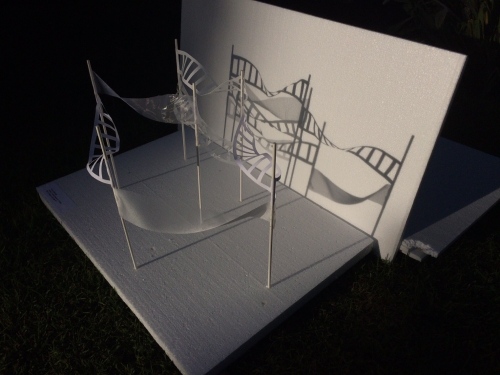
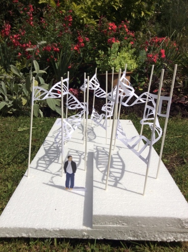
The first three photos were taken in July at midday in the garden.

Photo 1: Looking short end on

Photo 2: Looking straight at the long side

Photo 3: Looking from above

The photos below were taken on 11 July at 19:30hrs in the garden, when the sun was low in the sky. The sample is West-facing.

Photo 4: Looking obliquely

Photo 5: Shadow detail

Photo 6: Looking from above. Tone and shadow

Part 5 – Reflective Commentary

11 July 2017


Part 5 – Reflective commentary

Measurement against assessment criteria

In my blog post for Part 5, stage 7, I reflect in depth on the outcome of my process and final prototype/maquette for assignment 5. In this reflective commentary, I broaden my focus to the module as a whole, and target my response to the assessment criteria, course aims and outcomes.

Demonstration of technical and visual skills

In the first four assignments, I acquired technical skills in surface distortion, joining and wrapping, moulding and casting and mono and collatype printing. 

For assignment 5, I took the concept of a constructed repeating surface and looked at ways of enriching it by applying distortion techniques. I considered scratching, and cutting flaps and holes, but in general, found that these processes detracted from the purity of the geometric shapes. It was a valuable lesson for me to understand that complexity can lead to visual ambiguity and confusion and do not necessarily an enhanced outcome. It I am glad that I was able reach this conclusion in time to change tack and adopt a more simplistic, minimalist approach.

Design and composition played an important role in selecting a concept and resolving it to a final prototype/maquette. I was able to apply my spacial awareness through drawings in my sketchbook, to understand how shapes could be joined and the impact of negative space and shadow. It took an appreciation of the role of light (and a degree of self restraint) for me to reject the two bold colour schemes which I had been working on in favour of an achromatic white surface. This allowed me to focus on the most visually relevant aspects of my sampling; light and shadow.

In assignment 5, I was surprised at the number of occasions when I was able to draw on my technical experience of and visual vocabulary from earlier parts of the course (for instance, I used my sketchbook work from part 1 to inform experiment 2.2, my knowledge of joining curves surfaces to create an undulating surface in sample 10, and my experimentation into holes from exercise 4 of project 2, part 1 to inform samples 1-12 and my final prototype).

Outcome

In the first two-thirds of the assignment, my sampling did not produce the visual impact I was seeking. Looking back, I was perhaps too focused on outcome (which constrained my thinking). A tendency towards overcomplexity also played a part.

When I eventually did find a concept which excited me, I relaxed and was able to think in a more considered way. I realised that I had probably discarded some valuable ideas too hastily. I made a few “postscript” observations in my learning log/blog which show (retrospectively) how I might have developed these concepts into successful samples/outcomes.

In my final prototype/maquette, I managed to achieve my aim of capturing rhythmic fluidity in a three-dimensional surface. There is also formality and structure the piece, giving a sense of orderliness, whilst a tonal variation and shadow provide a visual element which can be transitional (subject to lighting and a suitable installation site).

Demonstration of creativity

In my final assignment, I extended my thinking beyond that of a two-dimensional surface; taking a sample which was fixed onto a flat piece of card and extending the idea into a supported structure in three dimensional space. Applying and extending the principles of Katsumi Hayakawa’s “floating city” (2011) allowed me to visualise this transformation.

I had wanted to place a greater emphasis on the inventive use of materials. However, despite identifying examples of materials for creative reuse, I struggled to find ways to incorporate them in my sampling. On reflection, I think this is because my experiments tend to be process rather than materials led.  In future, perhaps I could redress this by taking a material (e.g. old bicycle inner tubes) and presenting myself with the challenge of creating a constructed surface from it. In retrospect, I think this would have produced some very different ideas which might have helped to push me to be more experimental and risk-taking. 

Context
 
This is the area where I have made the most important breakthrough; for the first time my contextual research had a direct and palpable influence on my sampling. Instead of just investigating, recording and drawing comparisons, I have been able to identify visuals, materials, and aspects of the nature of work to modify, adapt and apply to my own practice.
 
In assignment 5, I looked beyond textile practitioners and sought inspiration from architecture, and from sculptors who use light as their primary source of visual communication. I also looked to the influence of Japanese culture and sensitivities in the choice of colour, materials and form.
 
For my final prototype/maquette, I used ideas of the Japanese aesthetic adapted from the architecture of Shigeru Ban and Kengo Kuma to inform my concept. In particular, I considered the transient nature of light and shadow, the simplicity of shapes and the combination of natural and synthetic materials.
 
From artist Rana Begum, I took an interest in how people navigate and occupy three dimensional space, and applied features which would help viewer be aware of the space occupied by my sculpture (and the negative space within and around it). Specifically, being able to walk through my sculpture, having no single vantage point, and having it set on different levels, so that the same repeating element could be viewed simultaneously from more than one aspect.
 
Looking beyond the culmination of assignment 5 in a prototype/maquette, Shigeru ban’s installation “Ceramic Yin Yang” (2010) and Zandra Hussain’s installation “Numina” (2017) prompted me to consider the possibility of further development, either using selective,  and/or transient lighting or digital projection onto, or behind my sculpture’s surface.
 
Thinking ahead to my level 2 studies, a longer project should enable me to extend the value of my contextual research further. With enough time, I hope to be able to engage in targeted development of a technical process or to apply techniques from other disciplines which have not previously been used in a textile context.


Part 5, Stage 7 – Reflection

7 July 2017  


Part 5, Stage 7 – Reflection
 
Assessment against the project aims
 
In an email dated 23 May 2017 (Eastaugh, 2017), I gave an outline of my plan for assignment 5 as follows:
 
“The line of enquiry that I wish to develop is a constructed surface, based on one of three sample ideas from Part 1. The plan is that I will investigate these surfaces in conjunction with different surface/edge treatments and contrasting materials, and through sampling, decide which to take forward as my final piece”.
 
In the same e-mail, I identified the following as risks:

  1. Getting carried away and making too many samples, leaving insufficient time to develop ideas and write up.
  2. That the surface treatments might overcomplicate the ideas and detract from the aesthetics of the simple geometric shapes.
As I feared, the surface treatments did overcomplicate the ideas, which then resulted in less time than I would have liked to develop samples (see summary and review of practical work below).

My initial thought was that I could base my three dimensional surface on one of three structures from Part 1 (e.g. the Mobius strip). However, in emails dated 6 June 2017 (Morton, 2017a) and 20 June 2017 (Morton 2017b), my tutor made some really insightful suggestions about how I might explore and extend the concept:
  • Size, structure and scale of individual units
  • Light/shadow, opacity/transparency
  • 2D vs 3D – to consider the surface as structure without back or front and enclosing negative space.
  • Flexibility/rigidity of all or part of the surface/structure
  • Too consider disciplines outside textile practice for inspiration (in particular architecture).
Simply applying surface treatments and colour variations to existing structures no longer felt as if it would push or develop me enough.
 
Summary and review of practical work (investigation, experimentation and sampling)
 
My practical work can be summarised by the following stages:
  • A review of previous work (output/selection: A constructed surface was chosen as the development concept)
  • A phase of experimenting with different surface treatments (output/selection: a strip with ladder-like cut-out holes)
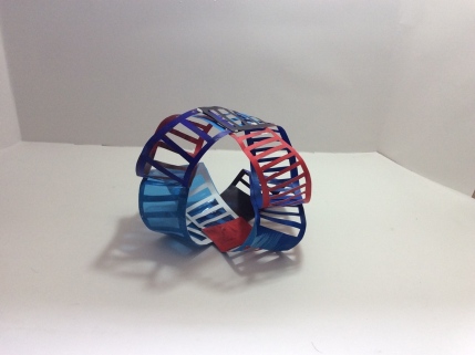
  • A phase of exploring different ways of joining, configuring and grouping the strips (output/selection: a twisted strip)
  • A phase of sampling with the twisted strip, exploring size, placement, colour (output/selection: A design for prototype/maquette)
  • Making the final prototype/maquette.

The experimentation into surface treatments did not prove particularly fruitful in relation to developing a constructed surface.  I concluded that it was an over complication which detracted rather than enhanced from my concept. Although I had spent much time and effort on the diversion (in effect an extension of part 1 of the module), the experimentation nonetheless bolstered my visual vocabulary. The output of my experiments was a strip with ladder-like holes.

Exploring different ways of joining, configuring and grouping the strips was also problematic. Frustratingly, my samples presented as surface pattern rather than exhibiting the rhythmic, textural qualities that I sought. A simplification of approach led to a successful outcome (samples 7 and 8), and I was able to move onto the final phases of sampling for, and making my final prototype/maquette.

As well as a tendency for overcomplexity, I recognised that I had probably been too hasty in disregarding from some of the my concepts (for examples, see sketchbook page 23 “Zip teeth edges”, and the insert between pages 40 and 41 “Twisted loop”, sample 2, and the insert on page 44 “Figure of eight”, sample 4). 

It was timely that one of the areas of suggested reading/viewing in my assignment 4 feedback was Bruce Mao’s “An incomplete manifesto for growth” (Mau, 2010-14) – a list of directions about how to encourage creativity and development. Number 2. on the list “Forget about Good” and number 3. “Process is more important than outcome” were especially pertinent.

Thinking back to the start of the assignment, I was over anxious about producing a “good” output, so instead of of sticking with my ideas and trying to look at them afresh, I simply moved onto the next. Mau suggests that to be innovative and grow it is necessary to remove the constraints of the judgement of outcome and venture into the risky and unknown. 

When it became apparent that my approach wasn’t working I “allowed events to change me”  (number 1. On Mau’s list). Taking influence from my contextual research and guidance from my tutor’s emails, I came up with simpler ideas which I investigated thoroughly. I began to get more fruitful results and exciting lines of enquiry.

Although I chose sample 11 to develop as my final prototype/maquette, I feel that could also have developed successful outcomes from samples 9 or 10. With additional time, I would have like to investigate further variations in scale, colour, layering and materials. In fact any of these samples could easily have been turned into a series of related works.

I love colour, and particularly bold contrasts of hue, as reflected by the two colour schemes in my sketchbook (pages 19 and 57-58). These reflect an attempt to portray drama, passion, (perhaps even anger or violence), and form an important part of my personality and creative voice. The Japanese aesthetic (which had strong influence on my final piece), however, celebrates natural materials, a gentle sensitivity towards nature, weathering and the visual manifestation of use and wear. I feel an affinity with these Japanese sentiments too, and felt that my colour schemes were incompatible with the direction I wanted to development sample 11. I reluctantly had to drop them from my final piece, but hope that they might find application in future projects.

I sought to extend my sampling by considering placement, in particular with respect to materials choice and the effect of light on a full scale realisation of my maquette. I also touched upon the use of image projection and lighting effects and the benefits of multi-disciplinary collaboration,


How well did I address the points in my assignment 5 developmental action plan?

Problem areas to improve:

1. To make sure that I use sketching to record my responses to sampling – in particular to assist with development (such as design and composition), and as a springboard to propose further ideas.

On several of the modules in this assignment, my tutor has commented that I could be using sketching more routinely, not just to record and observe, but also to inform and develop the progress of my sampling. I have tried to extend the use of my sketchbook, including more sketches, and in particular, using them to hone in on areas for development. By means of example, sample 1 (pages 33-38) and samples 7 and 8 developing into sample 9 (pages 47-54).
 
Despite my efforts, I still think that I could have pushed my sketching further, and I feel that it will take determination and practice before this becomes second nature.

2. To make sure that I consider and record how I will use the technical and aesthetic knowledge I am acquiring to inform my practice.

An observation of my assignment 4 reflective summation was that I could have included more about how new techniques and aesthetics will impact my practice. I have attempted to be more prescriptive in my assignment 5 learning log/blog, for example: I have described how artists such as Rana Begum and Zandra Hussain use coloured light instead of paint as the primary visual art form in their installations and described how these techniques could be applied to my practice through sampling.
 
3. To be more experimental with materials, and to use them to push the boundaries of my experimentation and sampling.

I found this area the most difficult, and I will discuss it as a development point in my reflective commentary.

Strengths to extend and apply in different ways:
 
1. To continue with my thorough contextual research, but to extend it by looking to other disciplines. To think about material, visuals, and the concepts/nature of multidisciplinary creative practices and how these ideas might be translated to invigorate and enrich my practice.
 
I have been really pleased with the way in which my contextual research is developing to influence my practice. I will discuss this in detail in my reflective commentary.
 
2. To continue to explore and develop an emphasis on conceptual ideas and connotations beyond visual aesthetics. To use these ideas to inform my sampling and development.
 
In assignment 5, conceptual ideas didn’t form the basis of my line of enquiry. However, I took the opportunity to record conceptual thoughts in relation to my samples when they arose (i.e. Grenfell fire parallels, experiment 6.3, sketchbook page 30, description in blog entry)
 
Paul Nash study visit, June 2017
 
The key learning point that I took from the study visit was the way in which Paul Nash used process to develop an idea (exemplified by room 4 of the exhibition “Life of the inanimate object”). Starting from an object (e.g. A chair leg, tree root or park bench), Nash prepared a series of sketches, photographs and collages and used these to investigate scale, placement and groupings. He also focused on particular areas of interest – for example details of form or texture.

Edge Magazine, Issue 4 “Growth”, July 2017

I was pleased to have been able to contribute (for the first time) to “Edge-Zine”, (an arts magazine produced by a small collective of past and present OCA students, co-ordinated via Facebook). To date, three issues have been published, the most recent being concerned with the topic of “Growth” (Edge-Zine, 2017). 
 
As well as being a valuable and inspiring resource, contributing has given me opportunity to interact more closely with the community OCA students. Being someone who is creatively stimulated by conceptual ideas, I was especially pleased to see narrative and poetry included in the publication alongside visual imagery. I am looking forward to continued involvement and regular contributions to the venture.
 
 
References:
 
Eastaugh, N. (2017) MMT Assignment 5 – ideas. [Email sent to Cari Morton, 23 May 2017] 
 
 
Mau, B. (2010-14) An incomplete manifesto for growth. At: http://www.manifestoproject.it/bruce-mau/ (Accessed 11 July 2017)
 
Morton, C. (2017a) Reply to: MMT Assignment 5 – ideas [Email sent to Nicky Eastaugh, 6 June 2017]
 
Morton, C, (2017b) MMT pt. 4 feedback. [Email sent to Nicky Eastaugh, 20 June 2017]

Part 5, Stage 6, Prototype/maquette making

4 July 2017


Part 5, Stage 6 – Prototype/maquette making

The output from Stages 3-5 was sample 11 (below):

Man.jpg

I had already decided the scale and the basic structure. To develop this idea into a prototype/maquette, I needed to consider the effect of the following:

  1. Expanding/contracting the design
  2. Colour
  3. Materials
  4. Pattern repeat
  5. Placement
 
Expanding/contracting the design:
 
I had intended to do some sketchbook work to assess how these changes would look, but was defeated by difficulty of drawing. It was easier to move the paper straws into different positions on the polystyrene and photograph the result.
 
Increasing the spacing didn’t make much difference to the structure when it was viewed front on (see below):
 
 
The wider spacing did make a difference when viewed obliquely (see below top – control, bottom – wider spacing), however it doesn’t materially effect the beauty of the sculpture or shadows produced.
 
 
This is positive, because is shows that the sculpture could be easily be configured to occupy different sized spaces.
 
 
Colour
 
I made the decision not to introduce colour into the sculpture for three reasons: 
 
  1. I did not want to detract from the purity of form by introducing the complexity of colour.
  2. From the experience I gained sampling, painted/coloured strips did not show such marked tonal variations, and because this was a key feature of my sample, it was something I wanted to preserve in my final prototype/maquette (see sketchbook page 60)
  3. To introduce colour would have changed the aesthetic of the piece. The sample draws influence from work of Kengo Kuma and Katsumi Hayakawa, in particular the Japanese sensitivity to light and shadow which these practitioners employ and the feeling of calmness which is embodied by the white natural surface. 
 
Materials
 
Whilst Japanese practitioners are known for using natural materials (e.g. paper, wood, bamboo, indigo dye) Kengo Kuma often combines natural and synthetic (as already discussed in Part 5 stages 3-5 resolving the sample, sample 8). I wanted to investigate whether I could employ this idea in my final prototype, so I made a sample using the following natural and synthetic materials (sketchbook, page 62):
  • 75 gsm printer paper
  • Japanese tissue
  • Organza
  • Thick textured organza
  • Voile
  • Tyvek fabric 
  • 105gsm Tyvek paper
I wanted to understand how the transparency, rigidity, and texture of each material effected it’s performance within the sample. Below is a photograph of sample 12, with a key to the materials used shown below. I didn’t worry too much about the form of the sample – just letting the placement of the vertical straws and the twist evolve without much thought as I added each piece.
 
I was able to eliminate Tyvek fabric because it was so soft and floppy that it wouldn’t hold any shape (so wouldn’t have been suitable for forming a twist). The thick textured organza and voile frayed too much to cut holes in, so I left them as solid strips. I didn’t really like the solid shadows and I found that the solid fabrics (albeit that they were semi-transparent) detracted from the purity of form of the cut-out strips.
 
The Tyvek paper and printer paper were almost indistinguishable in the sample, having virtually identical physical, light reflective and shadow-casting properties. I noted in my sketchbook that the Tyvek paper revealed a very attractive fibrous texture when lit from behind (see below). However, disappointingly, I was unable to create a similar effect when it was included in my sample regardless of the lighting conditions I used.
 
 
The Japanese tissue and organza were similar in physical and mechanical properties – very see-through with the appearance of being “barely there”, quite floppy and wisp-like, they almost seemed to float.
 
I was torn as to whether I liked this sample. On one hand I found it looser, with the appearance of being more free and flowing than sample 11; a feature which was attractive. On the other hand I found that the different materials gave it a rather disorganised (even scruffy feel), which I did not like. So on balance, although the idea of using either the organza or the Japanese tissue in conjunction with the paper or Tyvek appealed to me, I opted for the uniformity of a single material, and the formality of sample 11. My favourite material was paper, for it’s light and shadow reflective properties, so I decided to stay with it for my final prototype/maquette.
 
Post script:
 
Bearing in mind the intended scale of my sculpture, I would need to test the behaviour of the strip material (drape, rigidity and robustness) on a life-sized element of the sculpture in situ. I might find, for example, that the Tyvek paper I used for my maquette would not hold the shape of the twist when scaled up to full size, behaving more like voile.
 
The choice of material must also be made with an awareness of where sculpture will be sited. For example, Japanese tissue and paper are suitable for a piece placed indoors, whereas Tyvek and organza might be better choices if a waterproof/weatherproof option is needed. Durability must also be considered, as some the materials might tear in strong winds or degrade/rot after 6 months exposure to sunlight. These aspects would need to be investigated before committing to a final design.
 
 
Pattern repeat
 
In my sketchbook I gave some thought to the form of my finished sample (pages 59-60 and 64). Sample 11 already had repeat in the use of the cut-out strips made from identical material (paper), but I wanted to introduce an additional repeat in the form of the arrangement of the strips.
 
I considered joining three sample 11s in a wave-like shape, to add additional depth to my final piece. It was easy to join two sections to make them “staggered”, but it was not possible to join a third section (because of the vertical position of attachment of strips to the straws). I decided instead to make the third piece stand alone and to place it behind the other two.
 
Because I’d enjoyed the different effects created by looking at sample 11 at different angles, I decided to recreate this by placing the third block on a ‘plinth’ to slightly elevate it (see final prototype below)
 
 
Viewed under a multi-directional spotlight the prototype is full of subtle tonal variation with delicate lacy shadows cast onto the base structure. The photograph below shows different close-ups and different viewing angles:
 
 
This view reminds me of dusk or early morning (although it is artificially lit with multi-directional spotlights). There isn’t much light and the tonal variation is very strong, as are the shadows. It is as if the figure is very much within and part of the sculpture. 
 
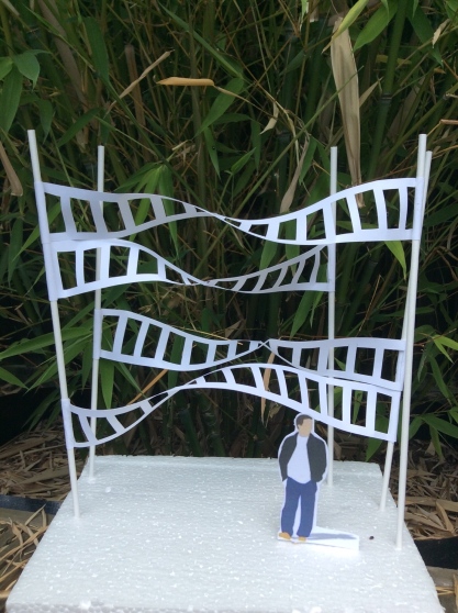
The strips remind me of flowing winds/cloud, but could also be interpreted a dense forest of tree trunks (the straws) with leaf canopy above (the strips). There is also reference weaving (the vertical straws analogous to the warp and the strips the weft). However, the influence of architecture (in particular urban skyscrapers) is very much apparent in the uniformity and repeating qualities of the structure.
 
I have asked myself whether the formality of my piece fits in with the Japanese aesthetic, and I have concluded that it does. Structure and order are strong features of Japanese garden design (for example), where every rock, stone and plant is carefully placed. Often there are repeating elements and a limited number of materials (e.g. raked stones, granite boulders and acer plants). It also fits with my experience of the work of Japanese creative practitioners such as Kengo Kuma, Shigeru Ban and Katsumi Hayakawa.
 
So far I haven’t mentioned the material I used for the base. Polystyrene was convenient because it allowed me to insert and reposition the paper straws to try out different configurations, but it also provides a white surface onto which the shadows project. The base (or floor) must therefore be considered an essential element of the sculpture, because not all surfaces would produce such lovely and well defined shadows. The white colour also provides very little contrast with the sculpture itself; important because it is only tonal variation which allows the viewer to decipher and interpret the position of the pieces and their orientation in 3 dimensional space. A material with similar properties would need to be found for my full-sized installation. In his sculpture Casalgrande ceramic cloud (2010), for example, Kengo Kuma has used white stones and water beneath his sculpture to achieve the desired light reflective and shadow properties (Kengo Kuma associates, 1990-2017).
 
Finally, if the installation is to be placed outdoors, then ambient light will be an important consideration influencing material choice. By means of example, an installation in Reykjavik will look very different if displayed in Sicily due to different weather, sky colour and light conditions. This is less critical for a white surface than one which is chromatic (where the amount of light and the appearance of colour varies dramatically depending upon light exposure). However, a shiny white material, for example might produce uncomfortably bright reflections in strong sunlight.
 
Placement
 
I have put some photographs in my sketchbook with some brief thoughts on placing my piece (page 63). The first consideration is whether it should be displayed indoors or outdoors.
 
The advantage of being indoors it that material degradation due to rain/frost/sunlight is less of an issue, so material choice is wider. Lighting can be completely controlled to maximise the impact of variations in tone and shadow. A large gallery with an upstairs viewing area (mezzanine floor), allows for the possibility of the sculpture to be walked around and viewed from both walking height and above. Another feature of an indoor installation which appeals is the fact that a changing backdrop could be projected behind the piece to show the different feelings which could be engendered by changing the surroundings. For example, compare the look and feel sample 11 placed against a backdrop of bamboo compared with the white background which I have previously photographed it against (see below)
 
 
The bamboo backdrop is shown above in fact a photograph pinned to the back of my viewing box. The multi-directional spotlights ensure that the shadows are still formed on the base of the sculpture. In contrast, the sample photographed in the garden next to the real bamboo plant has a very different feel:
 
The photograph was taken in conditions of cloud, and there are no shadows projected onto the sculpture base. The tonal variation of the white strips seems less pronounced, yet they look brighter and more light-reflective. The feeling is one of stronger contrast between the backdrop, and the sculpture and it somehow feels very alive.
 
These examples illustrate just how difficult it is to imagine what a sculpture might look like in situ, coupled with the fact that ambient light qualities will change with time of day and season. Other considerations may also come into play: i.e. when will the site be open for viewing, when are most viewers likely to pass by and see the sculpture, from what angle are they likely to approach? In my targeted research, I have given the example of Casalgrande ceramic cloud (2010), and discussed how Kengo Kuma has cleverly exploited an awareness of different light conditions to make his piece appear to change and reveal a different visual aesthetics throughout the day, depending on whether the light is shining onto the sculpture of illuminating it from behind.

Any placement of a sculpture in an urban environment must be made with an awareness how it will fit with buildings in the vicinity. For example: how do the shapes and negative spaces interact?, will a modern sculpture complement historic buildings or look out of place?, does the narrative fit? 
 
One example for placement which I give in my sketchbook is the forecourt of an exhibition building or theatre. In this case the orientation of the building is also critical; a tall, North facing building will cast the sculpture in shade for most of the day, meaning that the subtleties of light reflecting from it’s surface and shadow will be lost.
 
Because I like the idea of viewing my sculpture from different orientations and angles, undulating parkland seemed like a good environment to consider. I am thinking especially of the Yorkshire Sculpture Park, which I visited in June 2016 (Eastaugh, 2016). I recalled, in particular the effective placement of Elisabeth Frink’s Riace figures (Down by the Dougie, 2012). The viewer’s approach to the piece is controlled by a pathway, and at first they see just a tiny glimpse of the sculptures from the top of a hill. Viewed from afar in this way it is not immediately apparent whether the piece is a group of animals or people huddled in the trees. Approaching closer one can gradually start to discern the humanoid figures. Similarly, thinking about my own sculpture, approaching from the top of a hill and walking down a slope towards the sculpture would ensure that it was viewed from different angles, so that the beauty of the changing shape and negative spaces could be fully appreciated. This is a feature also employed by Kengo Kuma Associates in Casalgrande Ceramic Cloud (2010) (Kengo Kuma Associates, 1990-2017a).
 
Considering outdoor spaces also made me think about the maquettes displayed in Rana Begum’s Space, Light Colour exhibition at the Sainsbury’s Centre for the Visual Arts (sainsbury’s centre for the visual arts, n.d.). On pages 19 and 20 of my booklet containing exhibition notes, I have discussed “Maquette for no. 695”. I was especially interested that Begum decided to place her sculpture on a floating pontoon spanning a river, allowing it to be viewed from either bank and an overhead bridge. The water also provided a reflective surface for the coloured glass pieces. In an an interview about the sculpture (No. 695 Abraaj: An interview with 2017 winning artist Rana Begum, 2017)Begum discussed the challenges of finding a suitable outside space to show off the scale of the sculpture as well as mentioning the special light qualities in Dubai, where the piece is installed.
 
The prospect of artificially lighting my sculpture after dark is an exciting one which would allow me to harness the benefits of both indoor and outdoor placement. In the daytime, there would be the life and vitality of natural light on the surfaces and changing sky colour. At night, directional and selective spotlights could be used to emphasise particular areas of the sculpture and to produce spectacular shadows. This technique is exemplified in Kengo Kuma’s installation “Ceramic Yin Yang” (2010) (Kengo Kuma and Associates 1990-2017b). A video of the installation (“CCC Wall” di Kengo Kuma L’opera e i suo doppio, n.d.) shows how Kuma used selective artificial illumination and projection to produce and amazing display which presents transitional surfaces in the form of “dancing pebbles” (the ceramic pieces) and billowing sheets of coloured light reminiscent of the Northern Lights (the organza curtains). 
 
Another of the artists I researched (Zarah Hussain) also used the technique of projection, shining a changing digital image onto the surface of her solid sculpture in the installation “Numina” (2017) for the Barbican Centre. This might also be a technique which could be used in conjunction with my sculpture and offers exciting possibilities for collaboration.

References:
 
“CCC Wall” di Kengo Kuma L’opera e i suo doppio, (n.d.) [user generated content online] Creat. Casalgrande Padana At: https://m.youtube.com/watch?v=wb56dTX7iL4&time_continue=4&ebc=ANyPxKraBIxGSyKnVceEQNkCpDpj5JK37Svs-Xofu21eX0RtlY6f4xzugKdwAWZSOY0LhdSfyqAfZmcgekNSvnF9iWlsYebhPw (Accessed 10 July 2017)
 
Down by the Dougie (2012) Elisabeth Frink’s Riace warriors. At: https://greatacre.wordpress.com/2012/09/07/elizabeth-frinks-riace-warriors/ (Accessed 10 July 2017)
 
Eastaugh, N. (2016) Visit to Yorkshire sculpture park. At: https://nickyeastaughexploringideas.wordpress.com/2016/06/05/visit-to-Yorkshire-sculpture-park/ (Accessed 10 July 2017)
 
Kengo Kuma Associates (1990-2017a) Casalgrande ceramic cloud (2010) At:http://kkaa.co.jp/works/architecture/casalgrande-ceramic-cloud/ (Accessed 9 July 2017)
 
Kengo Kuma and Associates (1990-2017b) Ceramic Yin Yang (2010) At:
 
No. 695 Abraaj: An interview with 2017 winning artist Rana Begum. (2017) [user generated content online]. Creat. The Abraaj Group. 2017. At: https://m.youtube.com/watch?ebc=ANyPxKp8xnkLx4xf9hTCUHnlNIvKegcF7qxQ5hVgi2CohXDRgdGdsrJIsuQ8xa20zfhh6QWl4xPWuIrLipJhyFCli9xw-xObFw&time_continue=10&v=ycENyv6n7Ns (Accessed 10 July 2017)
 
Sainbury’s Centre for the Visual Arts (n.d.) Art and artists: Rana Begum: Space, Light, Colour. At: http://scva.ac.uk/art-and-artists/exhibitions/rana-begum (Accessed 10 July 2017)


Part 5, Stages 3 to 5 – Sample-making, recording outcomes and sorting (resolving the sample)

28 June 2017


Part 5, Stages 3 to 5 – Sample-making, recording outcomes, sorting (resolving the sample)

The starting point of this phase of work is the output from experimenting with surfaces: a strip with ladder-like hole cut-outs, and contrasting coloured surfaces (below).
 
 
The aim of this stage is to resolve this idea using sampling, and at the end of the process, to have selected the best concept to use for my final piece.
 
Before I started on the practical work, I conducted some detailed research specifically targeted at my concept. I looked especially at light and shadow, reflection, architecture and repeating patterns of Islamic design. I wanted to reach beyond the obvious influences of textile practitioners. 
 
I started my practical sampling with an exploration of form. In items 1-6 below, I used either one or more of the strips on the inside back cover of my sketchbook, or the piece of painted cut-out pelmet facing labelled experiment 6.2, at the bottom of page 29 of my sketchbook. Because of time constraints, I simply configured the strips with blu-tac, photographed them and then took them apart to use for the next sample, so samples 1-8 do not physically exist.
 
 
1. Spirals
(sketchbook pages 33-38)
 
I experimented with different lengths of strip, and strips with different sized cut-outs. In each case, I joined the short edges in a way which was “staggered” to produce a spiral effect (see experiment 7.1 below):
 
Example.jpg
I also joined a longer strip in this way, which had blue cellophane stuck to it (experiment 7.2)
 
 
A two-sided piece with different coloured surfaces (experiment 7.3)
 
And one with larger cut-outs (experiment 7.4)
 
 
The first sample idea I had was to combine them in a group of three (sample 1 below):
 
 
I was disappointed. The shapes had been attractive when viewed singularly, but when placed together there just seemed to be too much going on. The spiral form was lost and the overall image was not easily read. This visual complexity meant that I couldn’t imagine the sample working as part of a constructed surface. I wanted rhythm, easily identifiable repeating units and a sense of surface. The sample provided none of these attributes.
 
Despite my disappointment, I took note of the beauty of the shadows, especially with regard to the elongation and contraction of the “rungs” of the ladder, and the blue shadow cast by light through the cellophane.
 
In my sketchbook, I went on to investigate how I might combine spiral elements in column-like arrangements. I looked at stacking them tightly together, or alternatively leaving a space between each element. I thought about increasing the number of twists and changing the diameter of the spirals to make the wider and shorter. On page 36 I explored the effect of scale (see extract from page 36 of my sketchbook below):


Despite these investigations, none of the arrangements excited me; they all seemed very safe and conventional. Also, I felt that I was moving away from the idea of a constructed surface, so I went on to the next idea.
 
 
2. Twisted loop 
(sketchbook pages 39-42) 
 
The twisted loop is similar to that which is worn as a charity ribbon (for example for AIDs or cancer awareness) – see experiment 8.1, sketchbook page 39.
 
 
I first looked a combining a group of three of these twisted loops, joined at the short ends (sample 2). In my sketchbook, I photographed the sample both from above and obliquely, then turned it over and photographed it again from the other way up. The view I most like is shown below (and is from the top left of page 40 of the sketchbook).
 
 
The views looking obliquely were difficult to read, but the two from above and below showed the geometry clearly, which I preferred. I also think the cellophane/white paper surface works well in contrast to the other two components which are similar in colour and material.
 
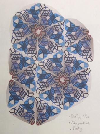
I then thought about how the image would look tiled:
 
 
My initial reaction was that the arrangement was pretty, and I could imagine it as a fabric design. However, I felt that it was too complex and with too much negative space to be turned into a constructed surface. 
 
I also thought about joining the trio in a radial fashion (sketchbook page 42):
 
I really like the pooling of colour, particularly in the radial design, which reminded me of lacy flowers. 
 
When describing these pieces in my sketchbook, the words, “pretty”, decorative” and “pattern” kept coming up. This intricate laciness was not really what I had in mind for my constructed surface. The word that was missing was “texture”. When joined together these pieces they were evocative of pattern rather than a surface. I also felt a lack of emotional response to the work which made it difficult for me to relate to the piece on anything other than a superficial level (i.e. an appreciation of it as decorative). Another reason why I decided not to continue with this line of enquiry is because the grouping only looks good when viewed from above or below, not obliquely.
 
Lastly, I considered a different way of attaching the twisted loops, so that they lay flat (sample 3, page 40). I didn’t feel that this arrangement offered any advantages over the ones above, so I decided to move on to the next idea.
 
 
Post script:
 
Looking at the shape afresh (as I write this blog post and with the context and benefit of additional research), I can visualise that with 4 strips, I could have formed a four pointed twist shape, joined at the corners to make an element for a constructed surface.
 
 
I have discussed how this would work in my sketchbook, along with how it might be stretched to make a expandable/contractable structure (inserted sheet between pages 40 and 41). It reminds me very much of the vulcanised paper surface used by Kengo Kuma in his IRORI and paper cocoon (2015) (Kengo Kuma Associates, 1990-2017a), which was my inspiration. However, this configuration only works because I have reverted to using solid strips; it would not have the rigidity or structural integrity to work with cut-outs (and I feel they would also add unnecessary visual complexity). Perhaps this is why the idea did not come to mind as I was working through my samples?
 
 
3. “Jelly bean” and figure of eight 
(sketchbook pages 43-44)
 
Both these shapes were inspired by the designs of Ron Arad (Ron Arad Associates, n.d.). The “Jelly bean” (sample 4, sketchbook page 43) was difficult to control when modelled with the paper strip. I could have considered a mouldable material, or a way of stiffening the paper after forming it. However due to time constraints, I did not feel able to continue with this line of investigation. A figure of eight shape, however, could be secured where it crossed over, giving extra stability and rigidity (see below):
 
 
Once again, I wasn’t really sure how this shape could be repeated and made into a constructed surface because the cut-outs made it quite complex, and I suspected that the geometry would be ‘lost’ when several shapes were placed together. The only shape that I tried was a “squashed” ball/sphere made by resting one figure of eight the opposite way around on top of another to create a central void (perhaps best illustrated by a photo – sample 4 below):
 
 
My initial thought was that the cut-outs made the shape appear rather complex. However, I included a scheme of how similar open spheres might be joined in either aligned or staggered columns on page 44 of my sketchbook.
 
Post script:
 
Although I was initially left underwhelmed by the thought of joining spheres to make a surface, writing this blog post gave me the opportunity to revisit the idea. I recalled the Abu Dhabi Art Pavilion (2013), a building designed by Japanese architect Shigeru Ban (Shigeru Ban Architects, n.d.). Shigeru used stacked cylindrical tubes made of cardboard to form the structure of the pavilion wall, which look similar to bamboo (very natural and in keeping with the surroundings). Being hollow, they provide for visibility and ventilation. However, the surface really comes to life when light falls across the openings of the tubes, casting shadows onto their interior. A different (and even more stunning effect) is obtained when the structure is artificially lit at night. This made me think of my concept in a different (and more positive) way. Because I hadn’t actually made a surface, I hadn’t properly explored the possibility of it being enhanced by light and shadow. Ban’s structure allowed me to consider that a very simple (even basic) construction can be visually very engaging if made with suitable materials and placed in the right surroundings. 
 
 
4. Mobius strip 
(sketchbook page 45)
 
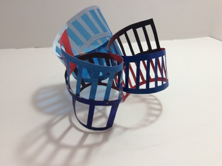
The structure which I was most disappointed with was the Mobius strip. The cut-outs made the shape visually ambiguous, especially when viewed as a group (sample 5, sketchbook page 45 – below)
 
 
The grouping has the appearance of a tangled pile of metal with no clarity of form. I could have reverted to a solid paper strip which I knew from my earlier work would produce a more structured surface. However, I felt that there wasn’t enough scope for development with this line of enquiry.
 
 
5. Stacked cylinders 
(sketchbook page 46)
 
The idea for this arrangement of the strips came from a building with offset floors (Chen, 2017). I was also seeking a very simple configuration, which might be more suitable for a constructed surface. I joined the short ends of each of three strips together then stacked them end to end (sample 6, page 46 – below)
 
 
It seemed a little lack-lustre, and in any case the structure was not stable. Without any excitement generated, it didn’t seem worth spending the effort of solving the problem of how to join the pieces.
 
 
6. Simple twisted strip 
(sketchbook pages 47-54)
 
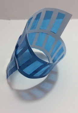
Searching again for simplicity, I had the idea of making a single twist in the strip, exposing both the upper surface and (the different coloured) underneath. I made two different arrangement of these strips:
 
a) Twisted in opposite directions (sample 7, page 47)
 
 
b) Twisted in the same direction (sample 8, page 48)
 
 
In each case the negative spaces were similar, but the strips twisted in the same direction had a more harmonious feel.
 
The samples reminded of a fabric sculpture by Japanese artist Masae Bamba called “Floating letters, falling words” (Taylor, 2013). In this work, pieces of Indigo dyes cloth are arranged on the floor to give the impression of ripples on water (a rhythmic disturbance of the surface). Bamba also associated the concept of water with pregnancy, and included printed “nonsense” characters which had been made by her daughter when she was learning to write. The piece was clearly very personal to the artist, however it was the concepts of transition, rhythm, repetition and the associated feeling of calmness and wellbeing which attracted me most. I hoped that I could create a similar response from my twisted strips if I arranged them in staggered rows to form a surface.
 
First, I did some sketchbook work – drawing the samples to understand their form, thinking about how I might arrange them and how I might use colour on the two surfaces. Unlike samples 1-8, this concept had the potential to create texture. I wanted movement, rhythm, gentle undulation, and a surface which would change depending on the direction from which it was viewed (inspired by both the architecture and Rana Begum’s “Space, Light, Colour” exhibition) (Sainsbury’s Centre for the visual arts, n.d.), and the “Pavilion” series of architect Kengo Kuma (Kengo Kuma and Associates, 1990-2017d).
 
I also wanted to use the idea of similar and contrasting background colours to make areas of my sample seem to either “melt into the background” or “jump out into the foreground” respectively. This was an attribute which I had identified in experiment 6.3 (page 30 of my sketchbook – see thumbnail below)
 
View1.jpg
 
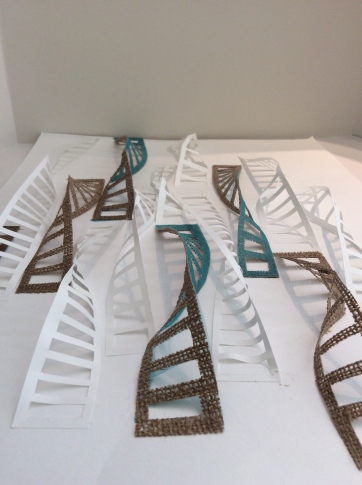
Mindful of the Japanese aesthetic of sensitivity to nature and the use of natural materials, I chose paper, hessian and silk for my sample. Paper also served the purpose of being readily available and an easy way to incorporate an identical material for both the background and the strips.
 
Referring to my contextual research, I had been particularly intrigued by the way that Japanese architect Kengo Kuma combined natural and synthetic materials in his structures (examples being “Ceramic Yin Yang” (2010), an installation contrasting ceramic pieces with a nylon organza curtain, and “Wind Eaves” (2015) a pavilion/shelter structure made of wood and covered with a fluorine-based plastic membrane). (Kengo Kuma and Associates, 1990-2017b, Kengo Kuma Associates, 1990-2017c) In “Ceramic Yin Yang”, the organza was used in a way which reminded me of sheets of water flowing down a waterfall or water feature, so I decided that it would be an appropriate material for my sculpture.
 
I started by conducting some experiments with stiffening and bonding fabrics to see if I could achieve a 2-layered strip with different colour/textural attributes each side (experiments 8.1 and 8.2, sketchbook pages 51-52). In general the method worked well, although there was some fraying of the edges of the silk and tweed in particular, which I wanted to avoid to keep the edges smooth, crisp and well defined.
 
Layering of the organza worked well, providing colour modulation and sparkle. I also particularly liked the pattern created by light and shadow with the hessian pieces (see below):
 
 
The photograph above shows that bonding organza to the hessian created a soft blue shadow which still exhibited the pattern of the hessian weave.
 
Next, I used my sketchbook to examine the effect of different layout patterns, and twisting the strips either the same direction or differently (sketchbook pages 50 and 51). I found that a mixture of twists in both directions, and strips of varying lengths gave a more dynamic feel, so this was my choice for the sample.
 
Due to the size and stiffness of the materials I was using, the smallest sample which I could made was A2 size. I needed to keep the twisted strips in place, so I glued each of the short ends to the paper background (see sample 9 below):
 
 
In the photograph above, the sample has been placed against a wall (in the same way that a picture would be hung). This has created beautiful shadows. However, my initial concept was for it to be placed on a flat table surface so that the viewer could walk around it and observe the surface from different angles. Intentionally, this gives a very different visual effect, because the different coloured surfaces and twists ensure that virtually none of the blue organza surface is seen for one direction, yet from the opposite side almost all of it is visible (compare the two photos below).


Looking down the length of the strips also produces a different feel to the piece.


Next, I considered what would happen if I flexed and disrupted the background paper. Because the strips were in tension, it was only possible to bend the surface inwards. However, the results were stunning, as the strips seemed to free themselves from the constraints of their mounting (see below)
 
 
Because the white paper strips are of identical material to the background, I don’t find this image visually confusing. Instead, I find myself rather fascinated that the strips are only visually defined only by a variation in tone and by their shadows. This makes for a very subtle effect.
 
This configuration gave me the idea of taking the concept a stage further; to come up with a way in which the strips could be completely removed from their background surface and used to make three dimensional sculpture. I recalled the beautiful and intricate paper sculptures of Japanese artist Katsumi Hayakawa, in particular “Floating city” (2011) which is suspended in mid air to create delicate shadows on the gallery floor.
 
I had the idea of attaching the short edges of the strips to poles which could be secured to a base in three dimensions. I only had five construction straws available (why didn’t I buy more!), so this constrained my sample. 
 
I was instantly struck with the feeling of movement. Rather than waves on water, the sample now felt more akin to waves in the air; soft, gentle and undulating, it seemed to suggest wind (or maybe the movement of clouds through the sky?) I also made a connection with weaving; the vertical poles representing the warp and the horizontal strips the weft. The presence of negative space between the strips made me think, in particular of the characteristic style of Sheila Hicks.
 
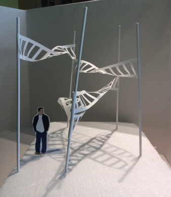
I photographed the sample from different positions and under multi-directional spotlights and it became even more intriguing (see below, sample 11).


One feature which I found especially engaging was the idea that the viewer would be able to walk through my piece (for a more interactive experience), rather than simply just walking around it. This gave me the idea of changing the scale, and considering possibly placing the sculpture outdoors (or at least in a vey large gallery space). I placed different sized paper figures next to my sample until I found a size where the scale felt comfortable (see below).


7. “Disrupted” ladder rungs 
(sketchbook pages 55-58)
 
This idea came from a piece of painted pelmet vilene which was left crinkled and creased after it had been used for experimentation (see below):
 
 
Thinking about Rana Begum’s exhibition (Sainsbury’s Centre for the visual arts, n.d.), and in particular, her use of fluorescents to reflect coloured light onto an adjacent surface, I decided to paint the underside of my sample in fluorescent paint to see if I could replicate the effect. I also varied the blue colour across the upper surface surface to produce a subtle sense of transition.
 
To make the constructed surface, I joined (sewed together) pieces in a similar fashion to patchwork. To make the “rungs” more inclined to buckle, I slightly curved the surface of one of the pieces, to make sure that when sewn together they wouldn’t rest flat (see sketchbook, bottom of page 56)
 
The result took me somewhat by surprise! (see sample 10 below)
 
 
I was not expecting the reflections to be anything like as bright. It was a stunning and engaging piece, however there was a conflict between the pink fluorescent and the yellow and green (which are closer to blue on the colour wheel). If I were to develop the idea further, I would restrict myself to fluorescent green (it being an analogous colour to blue). I also felt that there was too much of the “disrupted surface” and thought about placing uncut sections within the surface to break up the pattern and relieve the eye. I have recorded these ideas in my sketchbook, along with some experiments into strips which might be incorporated (sparingly!) (see sketchbook page 58).
 

Sorting: 

Samples 1-6 felt too pattern-based and not sufficiently textural to use for a constructed surface. Once the penny dropped, I was able to change tack and simplify my approach. Samples 7 and 8 followed, and I developed this line of enquiry first to produce sample 9, then sample 11.
 
Sample 10 was also very simple in concept and drew on the idea of using reflected light to cast coloured shadows beneath a surface. Although there were too many conflicting fluorescent colours, I have shown in my sketchbook that it could be simplified and developed to make what I think would be an excellent final piece. Similarly, sample 9 could make a successful final piece by using more of the same sized pieces on a larger surface and perhaps introducing more subtle variations in the colour. However, it was sample 11 which spoke to me loudest.
 
Sample 11 is a more more free version of sample 9; it suggests subtly, sensitivity and calmness. It is three dimensional and can be configured to different settings. It has the potential to be considered for indoor or outdoor installation. 
 
The sample clearly works very well with white paper strips, but I wonder if it might be further enhanced by the addition of accents strips of organza (white, or perhaps even blue?) Thinking about developing it into my prototype/maquette, I would also consider repeating the structure to make a larger piece, configuration (expansion or contraction), placement and materials.
 

References:
 

Chen, S. (2017) University of the Arts, London. Workflow – Collection: information file 3DDA Part 1 [online]. At: http://workflow.arts.ac.uk/view/view.php?id=78772 (Accessed 23 June 2017)


Design Milk (2017) Architectural sculptures made from paper by Katsumi Hayakawa. At: http://design-milk.com/architectural-sculptures-made-paper-katsumi-hayakawa/katsumi-hayakawa-void-solid-paper-sculptures-2/ (Accessed 5 July 2017)


Kengo Kuma and Associates (1990-2017a) IRORI and paper cocoon (2015). At: http://kkaa.co.jp/works/architecture/irori/ (Accessed 4 July 2017)


Kengo Kuma and Associates (1990-2017b) Wind Eaves (2015) At: http://kkaa.co.jp/works/architecture/wind-eaves/ (Accessed 5 July 2017)


Kengo Kuma and Associates (1990-2017c) Ceramic Yin Yang (2010) At: http://kkaa.co.jp/works/architecture/ceramic-yin-yang/ (Accessed 5 July 2017)


Kengo Kuma and Associates (1990-2017d) Casalgrande Ceramic Cloud (2010) At: http://kkaa.co.jp/works/architecture/casalgrande-ceramic-cloud/ (Accessed 12 July 2017)


Ron Arad Associates (n.d.) [online] At: http://www.ronarad.co.uk (Accessed 20 June 2017)


Sainsbury’s Centre for the visual arts (n.d.) Rana Begum: Space, light, colour. At: http://scva.ac.uk/art-and-artists/exhibitions/rana-begum (Accessed 4 July 2017)


Shigeru Ban Architects (n.d.) Abu Dhabi Art Pavilion (2013). At: http://www.shigerubanarchitects.com/works/2013_abudhabi_art/index.html (Accessed 4 July 2017)


Taylor, K. (2013) Masae Bamba: Falling letters, floating words. At: https://ocatextiles2.wordpress.com/2013/09/13/cloth-and-memory-2-curators-tour-with-lesley-millar/dsc_0112/ (Accessed 4 July 2017)


Assignment 4 – response to tutor feedback

20 June 2017

Assignment 4 – response to tutor feedback

My tutor for this module was Cari Morton. A link to her feedback can be found here.

Response to tutor feedback:

Summary of the main learning points with my responses:

1. A couple of instances where I could taken my ideas further and suggestions on how I might have done so:

The Aldeburgh lifeboat drawing (well developed in motif, repeat and colour, but not translated into print).

When it came to deciding which sketchbook ideas to translate into print, I felt that the Aldeburgh lifeboat station work did not fit as well with the print techniques as some of the other themes (i.e. Thorpeness and Sizewell seascape: reductive monoprinting, Maggi Hambling Scallop sculpture: collatype). Looking back, I can see that overall my printing focused more heavily on drawing (which I love), than on pattern or repeat. I am glad that my tutor has made this observation because it has drawn my attention on how I might extend and apply my sketchbook work in a different way.


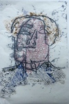
The collagraph portrait print (project 2, sample 3c) could have been refined into an interesting approach to image and/or pattern development.

Especially, my tutor mentioned the layering of different surface qualities and linear imagery.

Sample3c.jpg

Thinking about these comments in relation to my sketchbook work (see point 2, below), I can appreciate that sketching could have helped me to critique the sample in a more useful way. Instead of viewing it as a stand alone image to be judged as “successful” or “unsuccessful”, focusing on a particular areas of visual interest would have helped me think about how I might  apply the technique in a new context, or even to refine and develop it into a new approach. The ability to make this sort of mental shift is important because it helps to shape and develop a creative voice.


2. To use drawing to observe, record, extend and develop my prints:

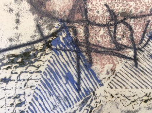
Because the prints were drawing-based I made a decision not to draw them. However, having read and considered my tutor’s feedback I can understand that it would have been a valuable exercise. In a few instances, I have used photography to focus on areas of interest (e.g. a close up of an area of burlap stencil print, project 1, exercise 4 , sample 4b reproduced in my learning log, and close ups of project 1, exercise 4, samples 6a and 6b on page 53 of my sketchbook). I can see that drawing would have helped to widen my thinking and perhaps push my sampling in a new direction.

3. To include a few evaluative notes alongside my prints:

Although I wrote a detailed analysis of my prints in my learning log (blog), my tutor made the point that it would have been useful to have included a few “first reaction” or “off-the-cuff” evaluative notes in the print folders alongside each image. I agree that this would have enriched the experience of looking at the prints, and would also have helped with cross referencing them to the evaluative discussion in the learning log. 

4. In my summative reflection, to have mentioned more about the impact of the knowledge I acquired (techniques and aesthetics) and how it will be applied to my ongoing practice:

I agree that I could have been more specific about how I will apply the techniques and aesthetics I have learned. It will facilitate me think creatively about context, development and my creative voice.

5. To write an plan of developmental action points and areas to focus on in part 5:

Problem areas to improve:

  1. To make sure that I use sketching to record my responses to sampling – in particular to assist with development (such as design and composition), and as a springboard to propose further ideas.
  2. To make sure that I consider and record how I will use the technical and aesthetic knowledge I am acquiring to inform my practice.
  3. To be more experimental with materials, and to use them to push the boundaries of my experimentation and sampling.

Strengths to extend and apply in different ways:

  1. To continue with my thorough contextual research, but to extend it by looking to other disciplines. To think about material, visuals, and the concepts/nature of multidisplinary creative practices and how these ideas might be translated to invigorate and enrich my textile practice.
  2. To continue to explore and develop an emphasis on conceptual ideas and connotations beyond visual aesthetics. To use these ideas to inform my sampling and development.


Part 5, Stages 3 to 5 – Sample making, recording outcomes, sorting (experimenting with surfaces)

17 June 2017


Part 5, Stages 3 to 5 – Sample-making, recording outcomes, sorting (experimenting with surfaces)

I approached this project by starting with a series of process-led experiments, concentrating on the exploration of surface properties (particularly texture and contrast); the aim/output being to select a single line of enquiry to develop on towards a prototype or maquette. 

My experiments were conducted in the context of one the following three structures, as a possible starting point for a constructed 2D/3D surface.

View_one.jpg Three_together.jpgFrom_above.jpg

My experiments can be subdivided into the following categories:


Scratching:

See sketchbook pages 3-6, page 7 (in combination with flaps), and page 18 (in combination with punching)

This exercise helped to ease me back into the course after a period of several weeks in which I wasn’t able to work. A library book on paper sculpture by Rouke (Rouke, 1993), made me appreciate that I had not properly realised the potential of this technique in Part 1, Project 4, Exercise 2, having only considered scratching as a series of isolated marks, rather than using them to produce a textured surface.

For these experiments, I used paper (of different types) painted with acrylic paint, which I removed by scratching. I looked at big scratches vs little scratches, pattern vs overall texture, different marks using different tools, and the contrast between areas of high and low density scratching. I lit the samples to see the thinned paper had become transparent or translucent, and used coloured cellophane to see how these effect might be exploited. 

I have made comments in my development and sketchbook alongside each of my experiments, noting the qualities of each, what I liked and didn’t like, and technical considerations (such as ease of working). 

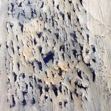
In particular, I found the experiment top right of page 6 (experiment 1.11, scratching diagonally using a scalpel, Khadi paper) very striking due to it’s texture and contrast of hue (see below):


In a development, I used handmade paper painted with a chalky paint and made rougher more irregular scratches which actually puncture right through the surface. I used these in combination with small regular holes made with a pin (experiment 1.14 – see sketchbook, page 18). This turned out to be my favourite textured paper because of it’s irregularity and rawness which I find more engaging than the cartridge and Khadi paper samples.

I also liked the idea of transitioning the of density of mark across the surface to create tonal graduation (see below, experiment 1.12, sketchbook page 6).


I envisaged that I might use a scratched surface as one side of the Mobius strip or circle, contrasted against a surface of different texture and/or hue on the opposite side. However, this felt rather “safe” with little scope for “pushing the boundaries” or risk-taking.


Flaps (incising and lifting):

See sketchbook page 7 (in combination with scratching), and pages 9-16

The use of flaps in conjunction with shadow and lighting (project 2, exercise 5) was one of the processes which excited me in Part 1, and the reason why I chose to revisit the technique.
 
I started by exploring a combination of scratching and flaps (sketchbook page 7), but I felt that they made the surface too confused and complicated (in conjunction with a constructed surface, the flaps would detract from the geometry of the repeated shapes by competing with them for visual attention).
 
I then looked at flaps on their own as a means of creating surface texture. I considered triangles (sketchbook pages 10-12) and semi-circles (sketchbook pages 13-16).
 
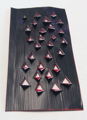
The triangular incisions and flaps created some very interesting textural surfaces and shadows which I explored by photographing my samples in different orientations (page 10-11). I also used sketching to investigate the effect of different sized triangles and changing orientation of the flaps/incisions to make a pattern (sketchbook page 12)
 
In particular, I liked the effect of painting the reverse of the surface a contrasting colour (red), which emphasised the flaps and also created subtlety coloured red-tinged shadows (see sketchbook page 11, experiment 2.2). This idea came from a sketchbook sample which I worked for Part 1 (see Part 1 Sketchbook – Theme “The Garden”, pages 21-22), and also from artist Rana Begum’s “work on paper” (2012) (Begum, 2006).


Once again, although I liked the surfaces which I was creating, I didn’t feel that they could be used successfully in conjunction with any of the geometric forms at the start of this blog post (for the same reasons of overcomplexity and competing for visual attention).
 
Next, I made a small sample of semi-circular flaps, arranged in rows, alternating the orientation of the semi-circle and opening (see the diagram on page 13 sketchbook clarification). The piece can be found as experiment 2.3 on page 13 of the sketchbook. Photographs of it in different orientations are shown below:
 
 
What I particularly like about this sample was that fact that it’s appearance changes depending on the direction and angle from which it was viewed. It also cast amazing shadows (see sketchbook page 13).
 
I used sketching to explore how this surface might appear if made from a thicker material, so that the edges of the incisions became a feature of the surface (page 15), and also how it might look is rolled into a tube or used to make a folded/zig-zag configuration (pages 14-16). 
 
I didn’t feel that the surface worked when configured as zig-zag pleats. I think this is because there is no harmony between the incisions (circular) and the angular form of the zig-zag folds. It also felt too safe as a design idea. 
 
When rolled into a tube, the sample seemed to come alive; there was the ability to see though the flaps to the reverse side of the tube, and there was harmony between the semi-circular flaps and the curve of the surface. There were shadows created by the flaps both inside the tube and on the outer surface of the cylinder. I started to experiment by placing the tube adjacent to a tube made from scratched and punched handmade paper (experiment 1.14).
 
 
This combination appeals to me because of the strong contrast between the chalky, ragged surface of the scratched sample and the smooth sharp form of the semi-circular flaps of the incised sample. It made me consider the possibility of making a tube structure, instead of using one of the geometric forms at the start of this blog post. I conducted a search on Pinterest and as inspiration for a modular constructed surface composed of tubes (Eastaugh, 2017).
 

Exploring texture and colour:

I selected a red, white and blue colour scheme, inspired by the colours used in several Oscar Niemeyer buildings, including the Museum of Contemporary Art in Niteroi (Design Buildings Wiki, 2017). I am drawn to the strong contrast of hue, and I find the combination of red and blue in particular attention-grabbing.

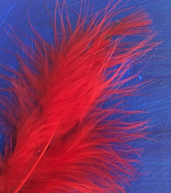
In my development sketchbook, I considered the contrasting texture of fabrics and other materials, thinking about how I might use these alone or in conjunction with textured papers (see pages 17-20). I slashed glossy stretch metallic and matt acrylic felt (experiments 3.2 and 3.4), contrasted red lacy sequin fabric with smooth acrylic-painted blue paper and used feathers, eyelash yarn and sequin waste and zip teeth for texture (experiment 3.3).

Combinations which I particularly liked were sequin waste and cellophane (experiment 3.3 below):


Red lacy or fluffy textures against bright blue acrylic-painted paper (sketchbook page 19, experiments 3.6 – left and 3.5 – right):


and juxta positioned torn and cut edges of paper (experiment 3.1, sketchbook page 17)  


I considered using lamination as a means of making fabric samples stiffer (so that they could be used in sculptural strips or shapes joined to create a surface). The results were disappointing (experiments 3.8- 3.10, sketchbook page 22). As well as not being sufficiently stiff, I also felt that the lamination masked the reflective and textural qualities of the materials (in particular the sequins and feathers), so I decided not to continue with this line of enquiry.


Edges:

In my preliminary research, I identified edge treatments as a possible avenue of research. The torn edges of strips of paper which I had assembled as part of my colour study gave an interesting contrast between the painted surface of the paper and the white interior exposed by the tear (experiment 3.1, sketchbook page 17).

I also thought about using a zipper or charred edge to create an interesting boundary. In the event, I was left feeling underwhelmed, because my sketches and computer modelling suggested that these treatments would detract from the form of a constructed surface rather than enhancing it.

Post script:

Having completed the assignment and with the benefit of subsequent experiments, I can now envisage that an edge treatment (such as the addition of a zip-teeth), would work really well with a very simple shape, such as rectangles or semi-circles. I know from dressmaking that zip tapes are often stiffer than the fabric they are attached to, in which case the zip teeth become distorted into a wavy edge. This could be an attractive feature, which might be used to make textured surface if a multitude of the rectangles or semi-circles were arranged together. At the time, this idea did not pop into my head because I was focused on the Mobius strip and more complex surfaces. Experience has now taught me that the most effective shapes are the simplest and in hindsight, I’m sure I would have been able to develop an successful constructed surface from this concept.


Stitching:

Because stitching is so time-consuming, I confined myself to one type (simple running stitch) which I selected to expose the colour transition of my thread. I chose a blue hand-spun hand-dyed yarn which was variable in thickness and colour. I sewed strands in staggered rows on curtain pelmet lining (which I selected for it’s stiffness and malleability). 

The photo below shows the thin rolled tube of stitched pelmet fabric placed adjacent to the rolled tube of painted and punctured/scratched handmade paper and a flat piece of card painted with acrylic blue paint (experiment 5.1, sketchbook page 27). I like the contrast of texture in this tube configuration with the different pieces. I also like the way that the stitching emphasises the long thin shape of the tube, and gives subtle tonal and textural variation across the surface. 


I also configured the sample in the shape of a Mobius strip (see sketchbook page 27), but didn’t feel it would be visually appealing when duplicated due to the stitching detracting from the simple geometry of the shape. Also, the stitching being double-sided meant there was a little contrast between the two surfaces.


Holes/cut-outs:

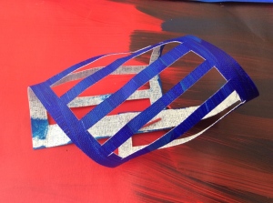
A reoccurring theme which fascinates me is the idea of placing holes, or “windows” across a surface so that they reveal only part of what’s behind. Starting with a strip of paper, similar in shape to the one I had used to make my Mobius strip (i.e. in the ratio of 1:6 width to length), I started exploring the possibility of cutting out rectangular shapes along it’s length.

At the same time, I wanted to explore colour transition, so I painted a piece of 130gsm paper with acrylic paint, graduating across the surface from red to blue, using different hues.


Next, I cut rectangular holes along the length of three similar sized strips. Some holes were uniform and evenly spaced, others were different sizes and with variable spacing (see sketchbook, page 31 and rear inside cover). 

Seeing the samples laid casually on top of each other on my desk made me realise that I was onto something visually exciting (see below):

There is a feeling of depth and movement implied by curling and accentuated by the fact that surfaces in the foreground and background are both visible. The pieces remind coiled springs, taught and ready to “ping” unsprung. There is also a suggestion of balancing; that the pieces might roll towards (or away from) the viewer at any minute. 

The strong contrast of hue between each surface of the strips helped to define the negative spaces. I love the fact that new (and different shaped) negative spaces are made where the “ladders” cross.

Because holes allow visibility of the opposite surface, more visual cues are available about curvature and distortion of the strip. This is implied by both the relative position of the ladder-shaped holes, and perspective (although it would be possible to play tricks with the viewer by changing the size of the cut-outs to compensate for perspective or to make the holes to suggest opposite to what might be expected!)

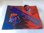
Next, I placed the three different 3D shapes I had made onto what remained of the surface I had cut them from (experiment 6.3, sketchbook page 30). The photographs below show a single set-ups viewed from two different angles:


Firstly I love the fact that such different results can be obtained just by walking around the arrangement and viewing it from different points. This is a feature which I personally find very engaging when I experience it in other practitioners’ work (often sculpture or architecture).

The second feature which works well is the different visual response depending on whether the contrast of hue is strong, or weather the colours are similar. When the contrast of is strong, the shapes (both positive and negative) seem to stand out and jump for attention, whereas where the colours are coincidently similar, the form is  barely noticeable, with shapes tending to blend into the background. This adds an extra level of visual depth and excitement.

Emotionally, I find the colours raw and explosive. I feel that there is drama (perhaps anger) in the arrangement. It occurred to me that I had produced this set of experiments on the day after the Grenfell tower fire in London. The cut-out shapes could be reminiscent of architectural blocks, or perhaps a fireman’s ladder and the red and black painted suggestive of fire and charring. Any recreation of the events, however were either unconscious or coincidental, but perhaps this explains why I feel a strong response to the sample?

Finally, I was interested to see what effect could be obtained by placing the pieces onto a mirrored surface (see below):

In a similar arrangement to the tangle of pieces as they laid on my desk, I let the components rest where they fell.

I also like this arrangement very much; the mirror reflects light, so the image is crisp and well defined to the viewer. The mirror allows the underside of pieces to be seen (which would otherwise not necessarily be visible) and there is a symmetry and rhythm created by virtue of the reflection. I was pleased able to take the photograph only reflecting the white ceiling and without the distraction other objects in the room (such as the TV and light fitting)! This was extremely difficult.

Once I started experimenting with this concept, I was quickly sold on the idea that it was the line of enquiry that I want to take forward and develop.I still have still to consider different ways that the pieces can be joined to make a shapes, how these shapes can be joined/interlocked/linked to form a surface. There are also considerations of size, scale and arrangement of components.


Sorting:
 
I embarked on this phase of experimentation thinking that I could use a textured surface to enhance and enrich a constructed surface (such as one of the three examples given at the start of this post). My conclusion is that in most instances, adding this extra complexity would actually detract from the visual aesthetics of the piece by disrupting the purity of form (geometry). 
 
Although the tubes which I made from my textured surfaces showed promise, my intuition was that this idea was too conventional and safe.
 
My preferred outcome and future line of enquiry is the twisted and coiled strips with ladder-like cut-outs, for the following reasons:
  1. Interesting and complex positive shapes and negative spaces are created when shapes are twisted, overlaid or combined.
  2. A surface made from these units will appear different depending on the vantage point/ angle from which it is observed (experiment 6.3)
  3. There is potential to design a configurable surface which can be changed depending upon the installation.
  4. The potential to explore/exploit shadow, light and/or reflection in the final design (experiment 6.5, for example).
  5. There is the potential use similarity and contrast of hue to respectively emphasis or suppress areas of the sculpture by making them appear to stand out or recede.
 
 
I feel that I have spent a lot of time and effort unnecessarily exploring surface texture when I should have been concentrating on shape and form. Resisting the temptation to delete this section, I have included it as a record of my work and so that I can draw on it as a learning experience.
 
 
References:
 
Begum, R. (2006) “Work on paper” (2012) At: http://www.ranabegum.com/page42/photos-5/ (Accessed 4 July 2017)
 
Designing Buildings Wiki (2017) Niteroi Contemporary art museum. At: https://www.designingbuildings.co.uk/wiki/Niteroi_Contemporary_Art_Museum (Accessed 5 July 2017)
 
Eastaugh, N. (2017) Tube Sculptures [Pinterest pin, June 2017] http://pin.it/N3kBSEx (Accessed 5 July 2017)
 
Rouke, N. (1993) Sculpture in paper. Massachusetts. Davis publications inc.
 

Paul Nash study visit 10 June 17

12 June 2017


Paul Nash study visit


Overview/introduction:

The study visit was held at the Sainsbury’s Centre for the visual arts in Norwich and was hosted by tutor Hayley Lock. The exhibition was essentially the same one that appeared at the Tate, London earlier in the year.

Paul Nash (b. 1889, d. 1946) was a British painter whose work spanned the period of both World Wars. Initially trained as a designer/illustrator, he served in active service during WWI, becoming an official war artist during the latter parts of the conflict. Nash experienced the full horror of the trenches, and had to endure the death of close colleagues. As a result, later suffered mental illness (which we would now describe as post traumatic stress disorder). He also suffered physical illness; notably severe asthma.

During the inter-war period, Nash continued to paint and draw, being especially influenced by landscapes, found objects (the life of the inanimate object), the prehistoric, ancient architecture, natural history and the emerging surrealist movement. In addition to painting, Nash continued as a writer, author of natural history and artists’ books and photographer. He later painted powerful images depicting the destruction of WWI, most notably the airframe scrapyard in Cowley, which he depicted as a sea of tangled metal in “Totes Meer” (1940-1) (Tate, n.d.a)  In his latter years, Nash reverted to landscape paintings returning to favourite scenes and the recurring themes of mysticism and spirituality. 


Focus on specific works and areas of interest:

Paul Nash was a prolific artist and it is possible to see development in style and influences over the course of his career.

The first of these is the crossover between his background in illustration: Nash’s work shows a characteristic interest in the use of straight lines and angles in the form of triangles and zig-zags. Theses feature are present is almost all of Nash’s works. 

Nash was interested in the spiritual (perhaps with a Pagan slant?), and his work is full of symbolism. The sun, moon, moonlight regularly feature in his paintings, as does the idea of the viewer “floating above” the subject matter of the painting; suggesting an otherworldly detachment from the scene. Also present is the suggestion of an “underworld”, the idea of there being a hidden world underneath the soil or water. The fruiting bodies of fungi feature frequently in Nash’s work. However the bulk of a fungus is in fact the mycelium; a strange branching, thread-like fibrous material permeating the ground or substrate from which the fruiting body appears.

Throughout his career Nash used a very distinctive colour palette; yellow ochre, pale blue, black and grey, soft brownish pink, olive and viridian greens. He also used a distinctive oxide red, as in the dock leaves in his famous WWI oil painting “The Menin Road” (1919), (Imperial War Museums, 2017) and the red tress and brick wall of “Behind the Inn” (1919-22) (Tate, n.d.b)

Throughout his career, Nash frequently bent the rules of perspective, deliberately using it to make his paintings more intriguing, for example “Nostalgic landscape” (1923-38) (Artuk, n.d.), “Pillar and moon” (1932-42) (Tate, n.d.c)

For the 1930’s, Nash became increasingly interested in Surrealism and became a pioneer of the Surrealist movement, promoting it through the International Surrealist exhibition of 1936 (Parker, 2017)

A recurring theme of Nash’s work is the English landscape. We saw in his early works that he had painted landscapes close to his home in Iver Heath, and the “Wittenham Clumps” (1913) (Nashclumps.org, n.d.) (twin beach woods on the site of an Iron Aged fort he had visited in Oxfordshire). After WWI he moved to Dymchurch is Kent and many of his paintings of the period (1921-25) reflect this seaside landscape, such as “Wall against the sea” (1922) and “The Shore” (1923) (Holford, n.d.). Many of these themes reoccur in this later work.

Perhaps the most interesting part of the exhibition from a student’s point of view was room 4 ‘Life of an inanimate object’ – essentially a study on how to develop a concept. This part of the exhibition gave insight into how Nash took an idea (e.g. a piece of wooden driftwood or found object) and worked it up into sketches, collages, photographs, exploring and focusing on particular elements, thinking about groupings, contrasts, or perhaps how the objects would look if placed out of context.


What can I learn from the exhibition and how will it translate to my practice?

  1. The exhibition demonstrated a process of how to use everyday objects to identify and develop ideas for visual art.
  2. It made me look at still life in a different way (i.e. that it doesn’t need to involve obvious/conventional grouping – for example his surrealist work).
  3. Elements of Nash’s practice which I could translate to my own work include mark-making and the use of line (in particular fine straight lines for texture), his colour palette, the intentional distortion of perspective.


References:
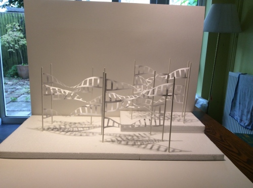
Atuk (n.d.) Nostalgic landscape (1923-38) At: https://artuk.org/discover/artworks/nostalgic-landscape-81330# (Accessed 5 July 2017)

Benson, E. (n.d.) Inspiring landscapes 3: “Wall against the sea”. [Pinterest pin, n.d.] At: http://pin.it/qrtwkDo (Accessed 5 July 2017)

Chambers, E. (Ed) (2016-17) Paul Nash. London. Tate publishing. 

Holford, J. (n.d.) “The Shore” (1923) [Pinterest pin, n.d.] At: http://pin.it/s0wSjs5 (Accessed 5 July 2017)

Imperial War Museums (2017) The Menin Road (1919) At: http://www.iwm.org.uk/collections/item/object/20087 (Accessed 5 July 2017)

Nashclumps.org (n.d.) Paul Nash and the Wittenden Clumps: Wittenden clumps (2013) At: http://www.nashclumps.org/early.html (Accessed 5 July 2017)

Parker, P. (2017) ‘Paul Nash’s commitment to the English landscape’ In: Apollo magazine. 13 January 2017. [online] At: https://www.apollo-magazine.com/paul-nash-tate-britain/ (Accessed 5 July 2017)

Tate (n.d.a) Totes Meer (Dead Sea) (1940-41) At: http://www.tate.org.uk/art/artworks/nash-totes-meer-dead-sea-n05717 (Accessed 5 July 2017)

Tate (n.d.b) Behind the wall (1919-22) At: http://www.tate.org.uk/art/artworks/nash-behind-the-inn-n04259 (Accessed 5 July 2017)

Tate (n.d.c) Pillar and Moon (1932-42) At: http://www.tate.org.uk/art/artworks/nash-pillar-and-moon-n05392 (Accessed 5 July 2017)